UXSA Volunteer Page
UXSA is an organization that supports the UX community in San Antonio by creating ways for people to connect, explore, and grow.
They wanted to redesign their Volunteer page to have better engagement from the UX community, by offering clear opportunities. They organized a Remote Design Sprint, and I participated as a UX Designer.
The Research
We were introduced to the stakeholders, and they were given time to explain not only the organization's business and social goals but also the expectations and benchmarks to measure the success of such redesign along with all the research that had been done to that point.
As they were presenting all the facts we proceeded to write our "How Might We's" sticky notes on Mural and at the end we put them to a vote and organized them into themes to start defining the most compelling "HMW" opportunities.
Not only the team voted on this but the stakeholders were also given the opportunity to vote to have a better alignment with the prioritization of the organization's goals.
One of the questions I asked the stakeholders for clarification was whether or not they were thinking about national outreach and opportunities or if it was going to be just a local effort. I thought it was important to address this given the nature of the current market trends, and from a user point of view.
The Design
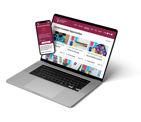
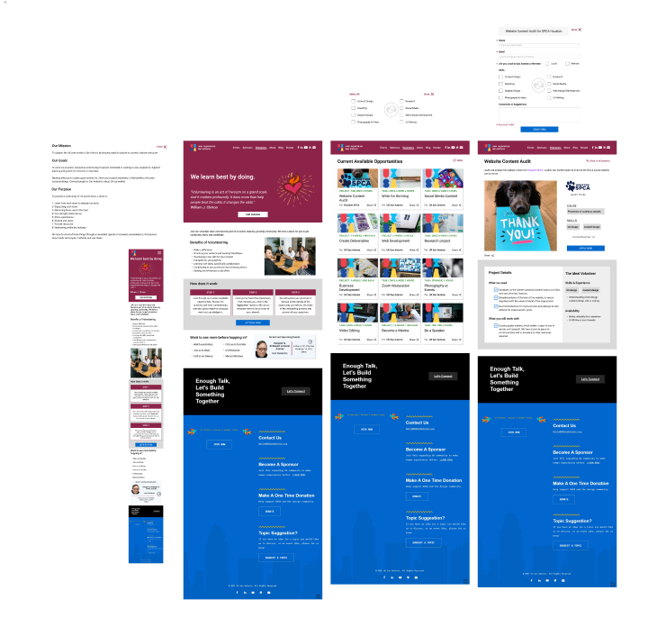
We began by sorting HMW (how might we) cards and discussing the main goals of stakeholders. During the ideate phase, each team member presented and explained their sketches, and we all voted on the best features. I then created a mid-fidelity design that incorporated the most popular features and sections, while keeping the structure of the website in mind. I decided to stick to the current website layout and created a main page with a call to action for the organization's mission, benefits of volunteering, steps to volunteer, and off-ramp options.
The design also included a search page with filters by skill and a detailed page for each volunteer opportunity. I believed this would address all of the main objectives for the design. The final prototype for user testing was done by one of the facilitators of the Sprint. We worked on the tasks and questions to ask the users recruited for the User Test, and groups were assigned to each user.
We managed to get four users for remote testing of the prototype that had been put together. Following the scripted questions and tasks, each user was paired with a team of two members of the sprint for better note-taking. Some of the most relevant insights from the user testing were that the order of information presented by relevance, time expectations, and skills filters were important, while the featured volunteer opportunities carousel was irrelevant.
My Design Proposal
Conclusions
This was a very interesting process. We ran into technical difficulties and time constraints but I believe we managed to accomplish the goals set for it. The sprint lasted 6 weeks, and ran on Saturdays 2-3 hours each session.
If I were to change something it would probably be the research side of it. I don't believe we had all the information that could've been relevant for this particular process and maybe use A/B Testing since there was another prototype that could've been used that might have cover some of the observations from the user tests.
I learned that teamwork is extremely important for this methodology and that constant feedback gives clarity to the overall direction of the effort.
It was very satisfying to see some of my ideas to go into the final product and the acceptance that users showed in the user tests. This was very motivating and encouraging.

