Construction Video Tutorials
With the popularization of DIY shows on TV, there has been a steady growth of users searching for video tutorials for small projects to do around the house.
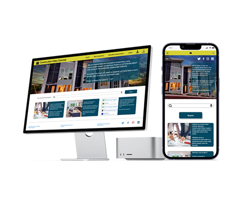
The challenge was to create a responsive website that delivers results by giving all the construction content needed in one place.
The Research
An initial Competitive Audit was launched but did not generate a lot of information about competitors. There are many video streaming websites with just a few related videos, and sites just focused on construction in general.
I developed a research plan with a few open questions to reveal user needs, motives, and pain points. There wasn’t a lot of clarity about who the main users would be for this product, except for homeowners in my initial draw. I still included 2 people that didn’t own a home but are working in the construction industry, just to test the value of the concept with a different group.
The research confirmed a few assumptions about the pain points, but including the two people outside the main target user, proved to be an impactful move that opened a new proposition value to address not only the research side of remodels but to include a new construction section with training value.
From that research, I proceeded to create my personas and empathy maps to understand the user’s journey, and the following pain points and goals became clear.
Pain Points
- Having to visit a lot of websites to find the videos waste a lot of time and causes frustration
- Results from search are not always related to what they are looking for, adding to the frustration overall
- No information as to whether the videos shown are for new construction or remodeling DYI
Goals
- Help the user to find construction tutorial videos in an assisted way, divided by new construction or remodeling / improvement projects
- Let the user save videos to watch later, at their own leisure
- Let the user check relevance or quality by a rating system, helping other users with the decision process
The Design
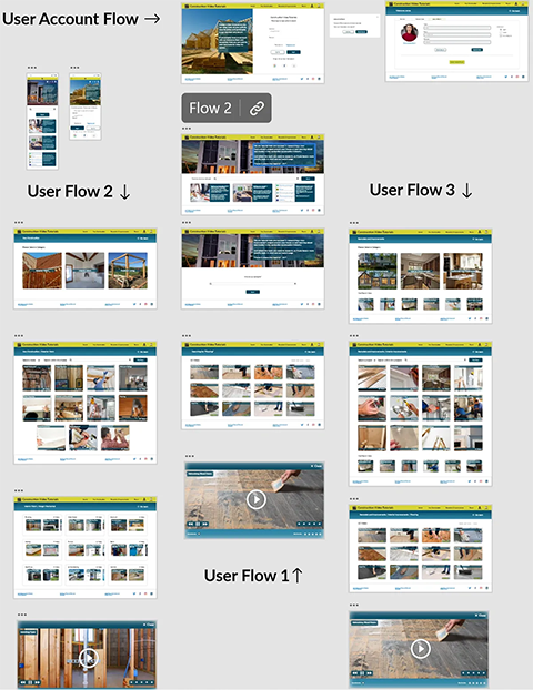
Based on my research, I created a design with simplicity in mind. I made sure not to overwhelm the home screen with too many video suggestions so that users could easily achieve their main goal. To achieve this, I created three different user journeys: two assisted methods by category, one for new construction and another one for remodels/DIY, and a simple search for those that wanted to search for a specific keyword.
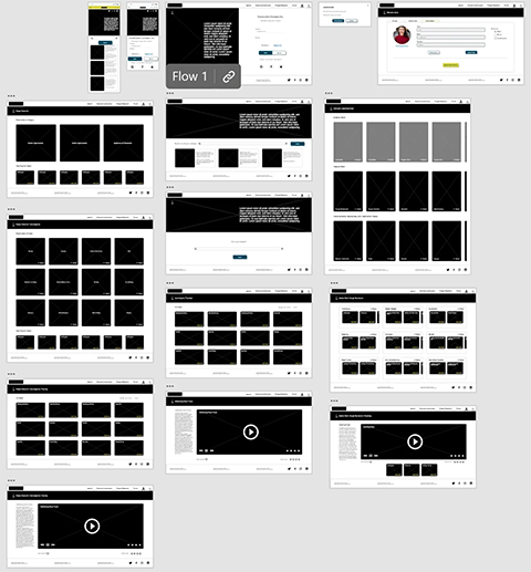
In my low-fidelity prototype, I added the three main user journeys with a simple layout to avoid overwhelming users with excessive information. I also addressed some of the pain points discovered during the research, and made the user interaction with the site more straightforward. I tested this prototype with eight users, and 93% of them completed their tasks on time. However, some people commented that there were too many choices when exploring new construction.
Based on this feedback, I decided to use the same steps for the user journey for new construction and remodel research to simplify the learning curve for new users. The information structure remained the same, so the information architecture didn't change. After finalizing the mockups, I generated the prototype and conducted a second usability test. This time around, 95% of users completed their tasks, but some suggested adding summaries for the videos. This was noted for future releases.
Wireframes & Mockups
Conclusions
One thing I learned was that when you include a user profile in your research that might not be the focus of the design but that in some way is related to your current project can open the scope of the project and increase its reach and user value, and at the same time increase of profit potential for the business.
I realized that even though it may not seem like a complex big product to design, the potential for it to grow, simplify user’s experiences, and help make the decisions and assist on normally complex and expensive tasks is enormous.
There is no measurement as to the success of this design in the real world, but having validated the simplicity of the user journeys and reflected on the benefits of having the one repository that’s missing in the real world, I consider this one in the success column.


